Propagation - A houseplant strategy game of pruning and plotting
Propagation is a playful and strategic tabletop card game about keeping plants alive amidst the chaos of daily life. Players each have their own collection of plants, and their goal throughout the game is to keep them alive and thriving. Throughout the game, they must manage limited resources, respond to unpredictable nature challenges, and occasionally deal with interference from other players. Each plant has its own unique needs, requiring careful attention and planning. The game combines simple mechanics with a little humor, inspired by my own shortcomings with taking care of houseplants, and evokes in players a sense of familiarity, silliness, and friendly competition.

The goal of creating Propagation was to understand how designers apply user experience principles to board game design to create an interactive and interesting product. The role of a graphic designer is constantly changing, but something that stays the same is the need for purposeful design thinking and innovation. Designing a game from scratch − from brainstorming, to iteration, to design, to production − start to finish was an effort to practice intentionality in creating products that not only look good, but improve the function of the product.

Research
To begin my capstone project, I focused on three key areas of research: user experience and the psychology behind board games, core game design mechanics, and current trends in the tabletop gaming market. My goal was to go beyond just creating a visually appealing product—I wanted to understand what makes a game truly engaging and enjoyable to play. By prioritizing functionality and user interaction early on, I was able to design a game where the visuals enhance and support the overall experience.
I explored how people interact with games on both a practical and psychological level, looking at elements like decision-making, risk-taking, and how players respond to different challenges. I used the Affective/Mechanic/Narrative framework to help shape the direction of my game, making sure the mechanics, themes, and visuals worked together cohesively. Market research also played an important role. I found that most board game players today are adults aged 18–34, and that social and strategy games are especially popular among this group. This inspired my decision to center Propagation around a relatable theme—plant care—paired with simple strategy and lighthearted competition, all designed with a contemporary, playful aesthetic.

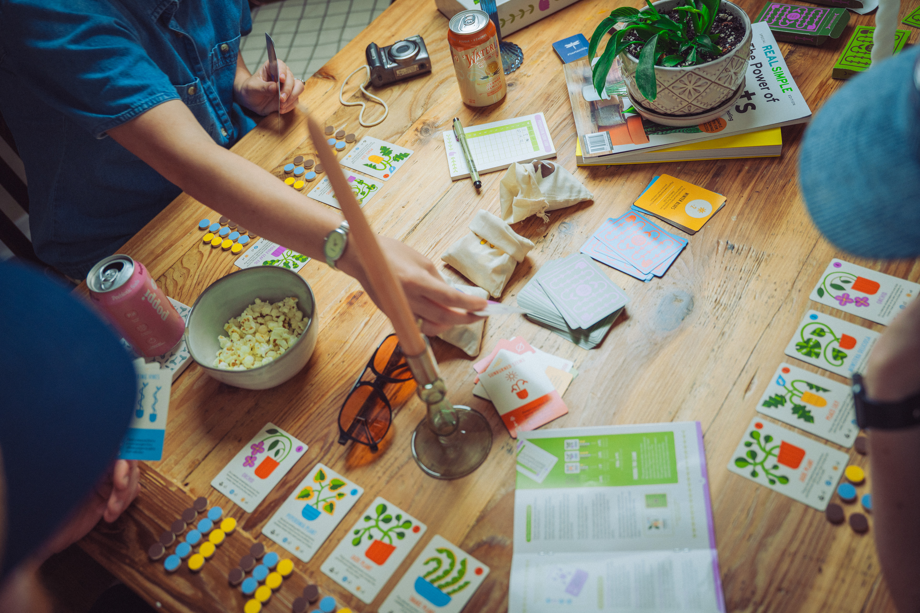
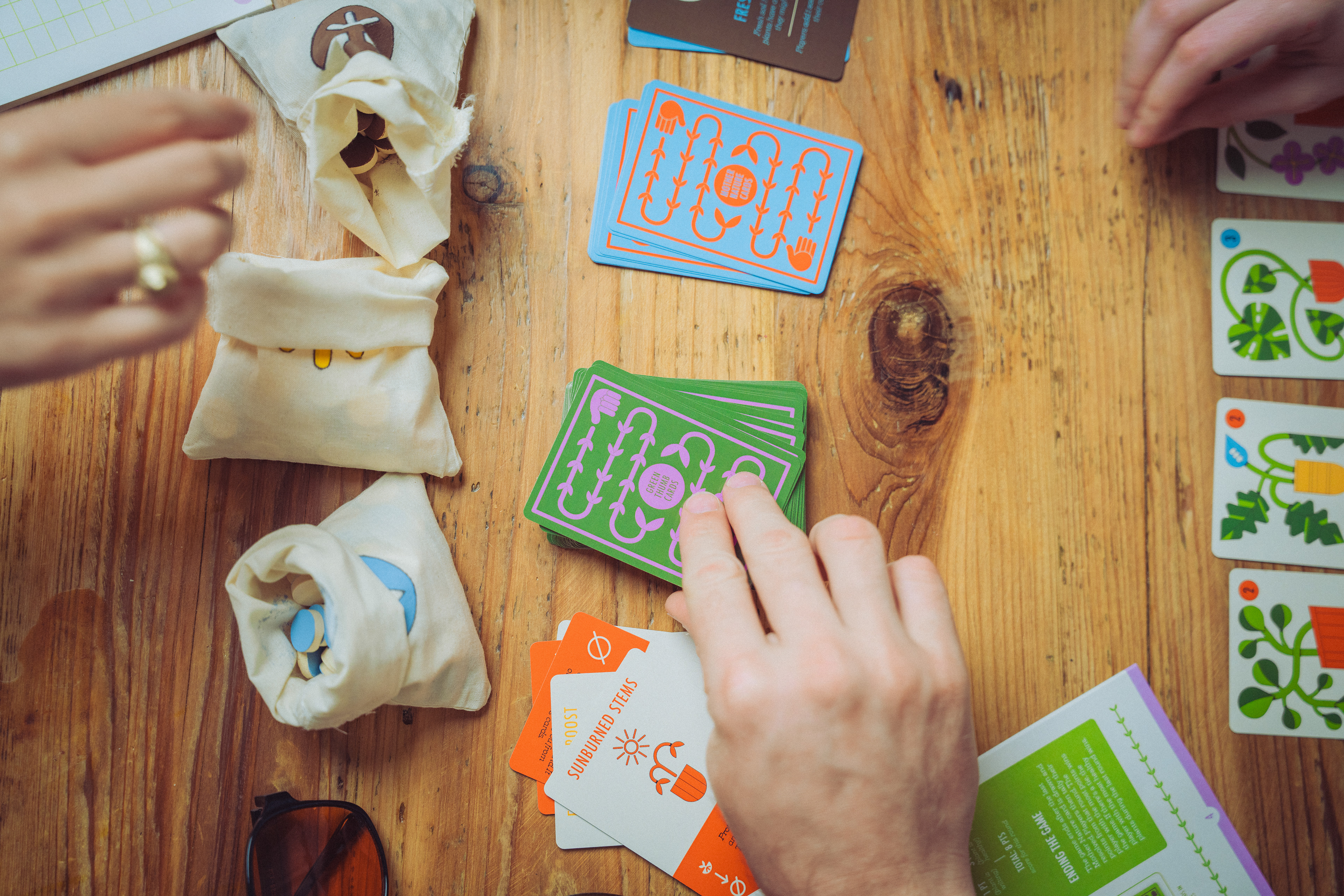
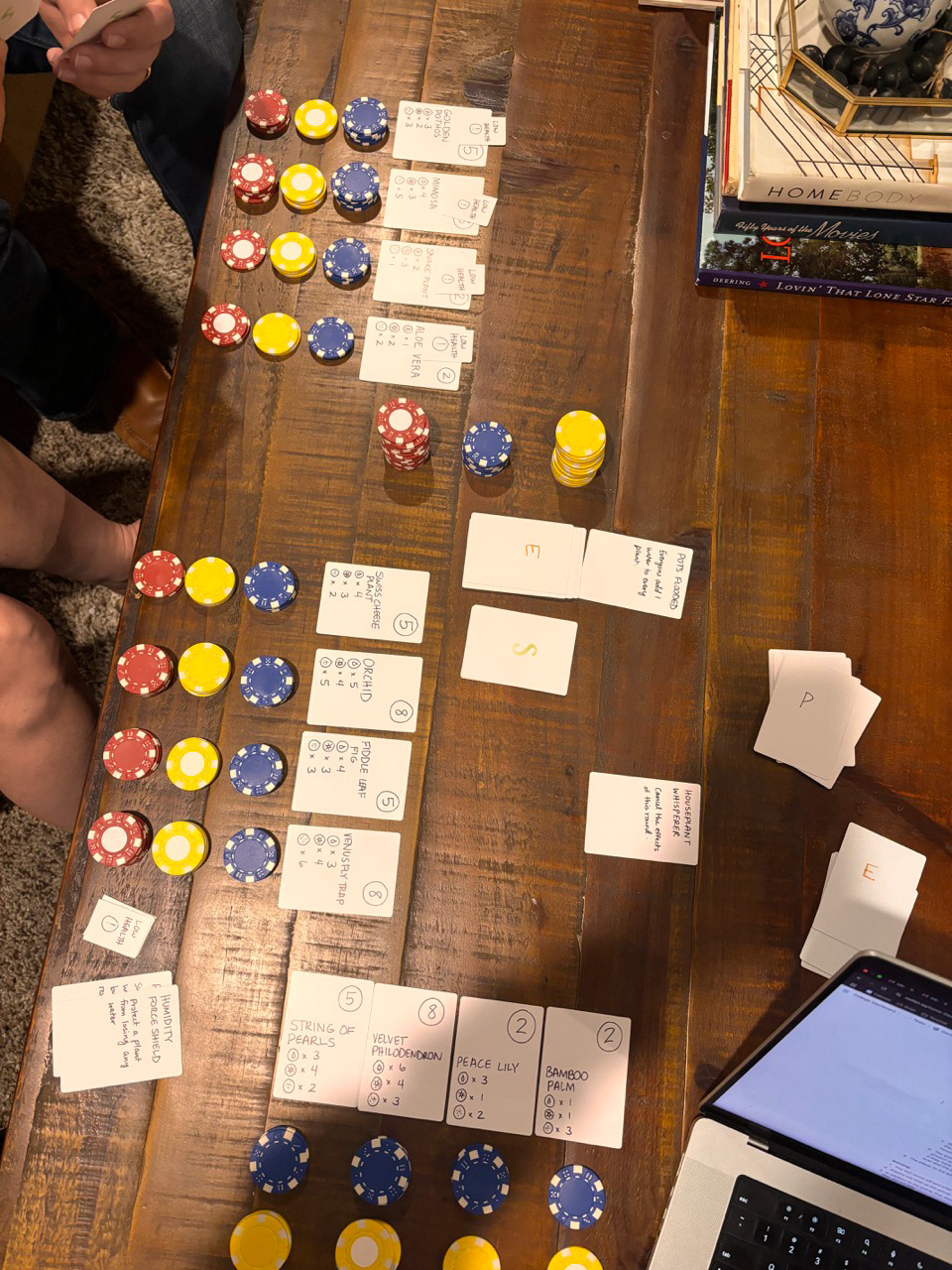
Playtesting Session 2
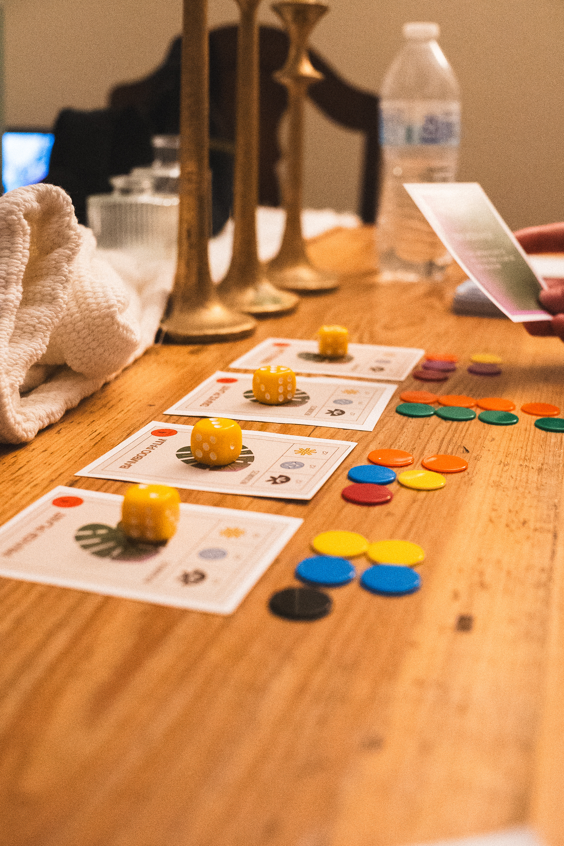
Playtesting Session 1

Taking notes during Playtesting Session 2
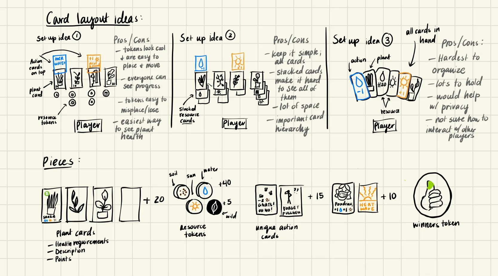
Initial sketches of gameplay and player setup

User survey I conducted during playtesting sessions

I created two different versions of the rules to find the best result
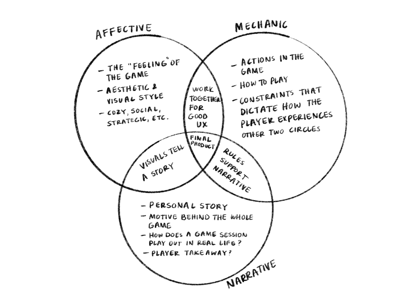
The Affective/Mechanic/Narrative method helped me to find direction for the game
The Process - Game Design and Playtesting
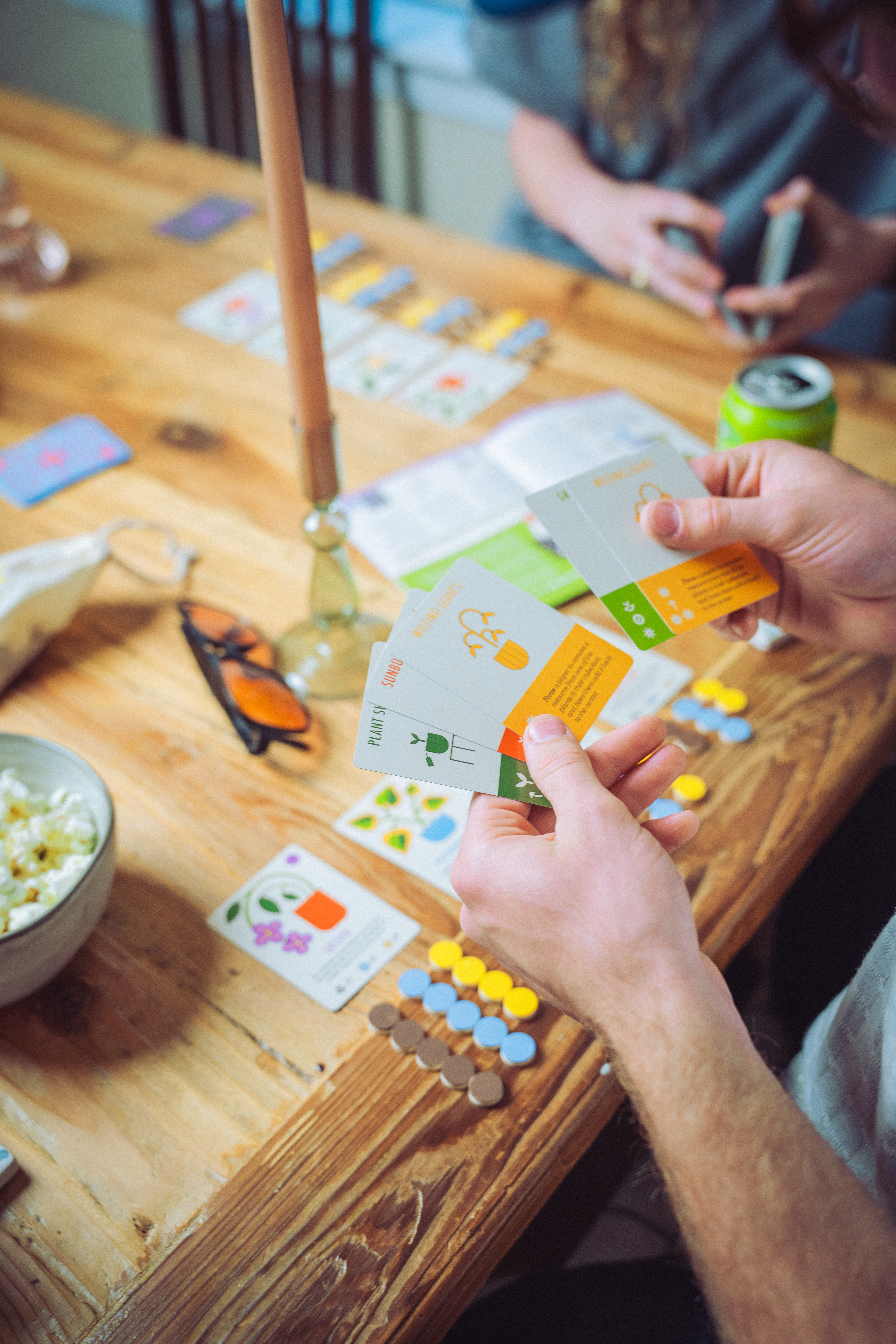
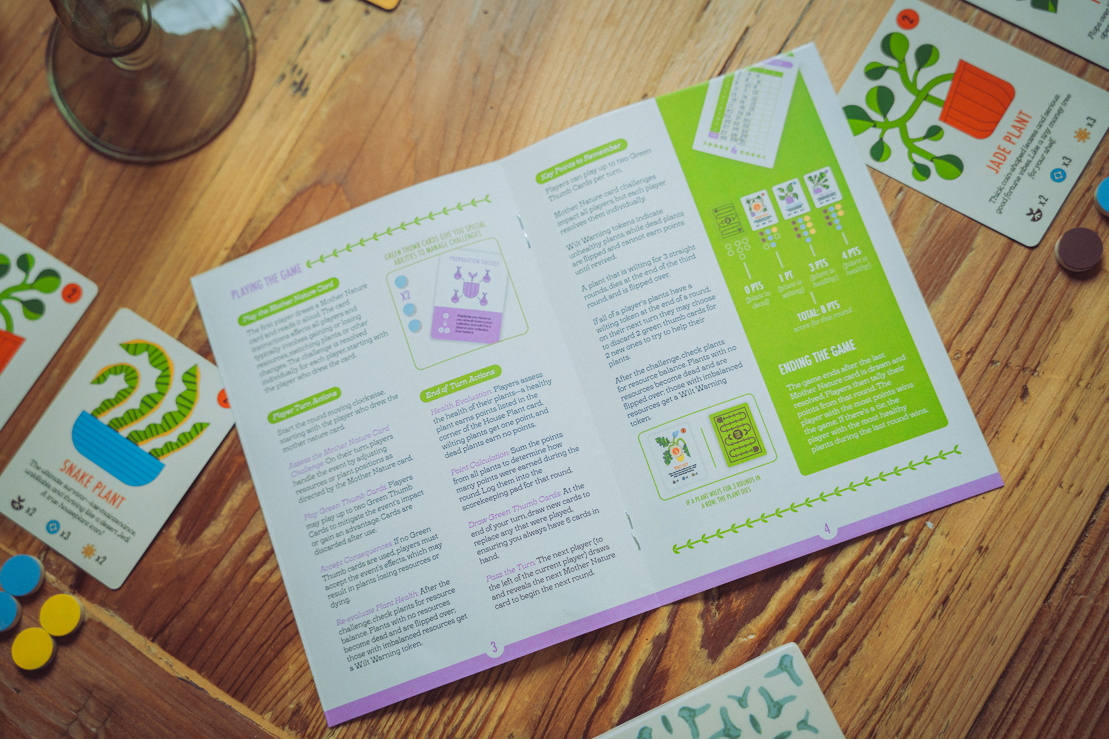
After developing the Affective/Mechanic/Narrative framework for Propagation, I began sketching out the game and figuring out how it might work. My initial idea involved each player managing their own set of plant cards using resource tokens, and that concept became the foundation for the rest of the mechanics. With help from my mentor, I created a Game Design Document (GDD) to keep everything organized—it included everything from branding and taglines to the full rules. I rewrote the rules three different times as I developed the game, each version getting more refined and organized. Between each rewrite, I held playtesting sessions to see how the game actually played out and used that feedback to make improvements.
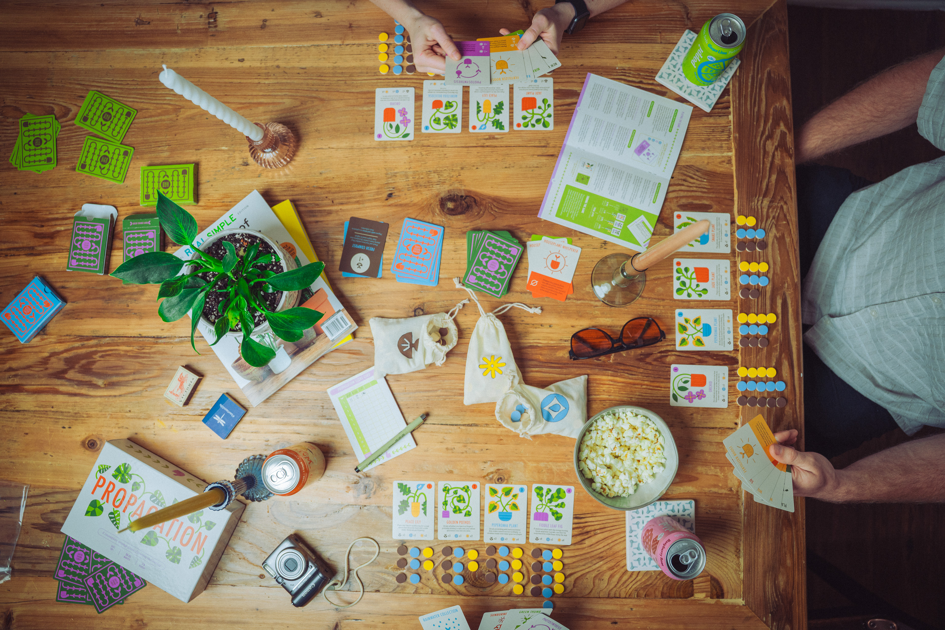
Playtesting was a huge part of the process. I held three sessions with different groups, starting with a simple paper prototype and rough rules. The first session helped identify what worked and what needed to be tweaked, and we even rewrote some cards on the spot to experiment. For the second round, I brought a more polished prototype and focused on testing two different rule variations to see which worked better. My mentor suggested doing both in the same session so I could get direct comparisons. I also created a feedback survey to better understand how players felt about each version. All of this helped guide my design choices later on, keeping the player experience at the center of the process.

The Process - Design
Once I had a solid direction from my Game Design Document and a few rounds of playtesting, I moved on to the creative side of Propagation. I started with the color palette since that usually grounds my design process. I wanted something that felt natural and plant-inspired—greens and browns—but also fresh and playful, so I added in bold accent colors like red-orange, pink, blue, and yellow. I made sure all the colors had enough contrast to be readable and even adjusted them after printing the first prototype to make them pop more.
For typography, I tested out a bunch of font pairings and landed on Futura Condensed Medium for titles—it’s bold, clean, and worked well with the more detailed illustrations. For body text, I used Tuppence, which added a quirky touch while still being easy to read. Since this was my first time designing playing cards, I also had to learn how to manage type size and condense text to keep everything readable without losing style.
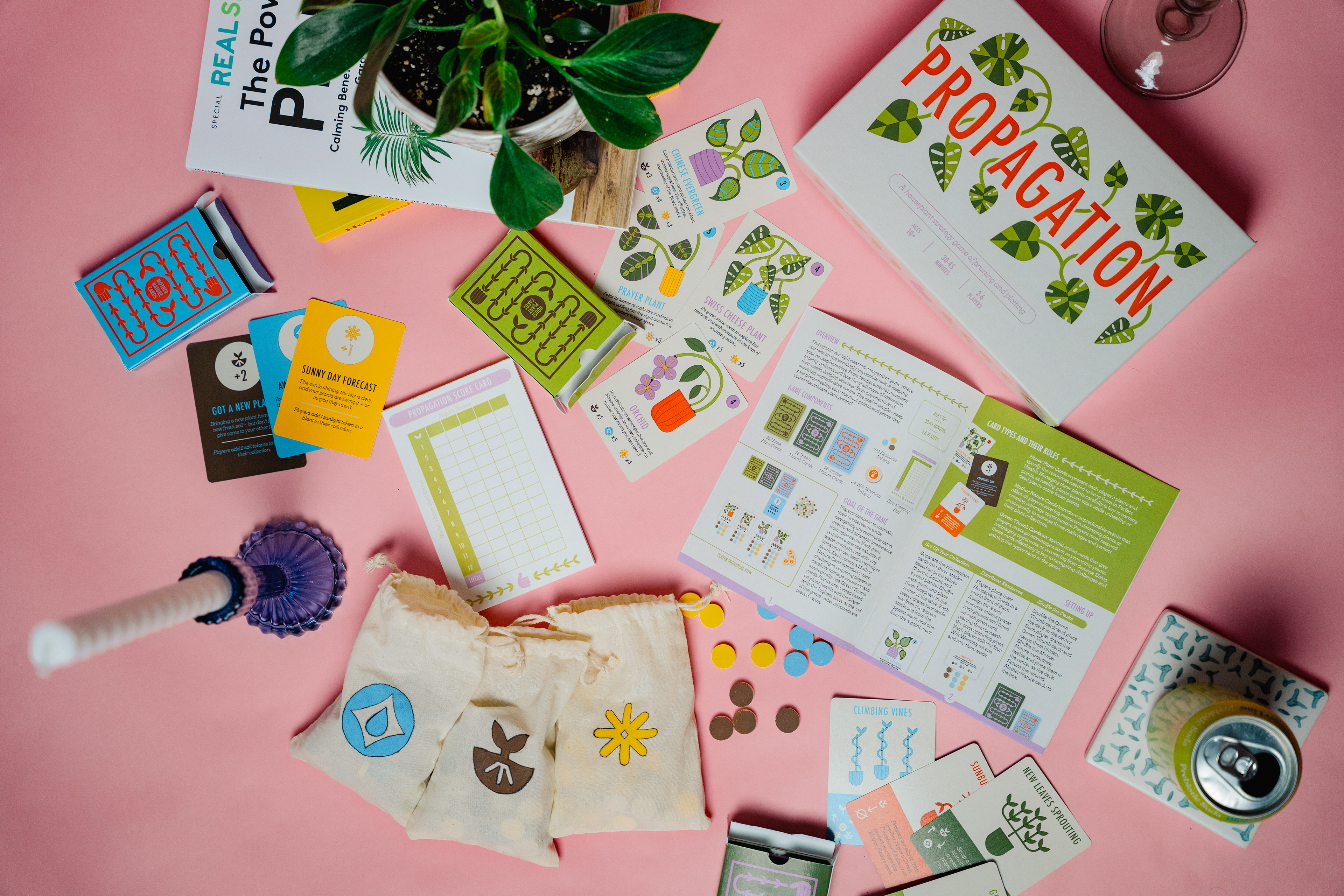
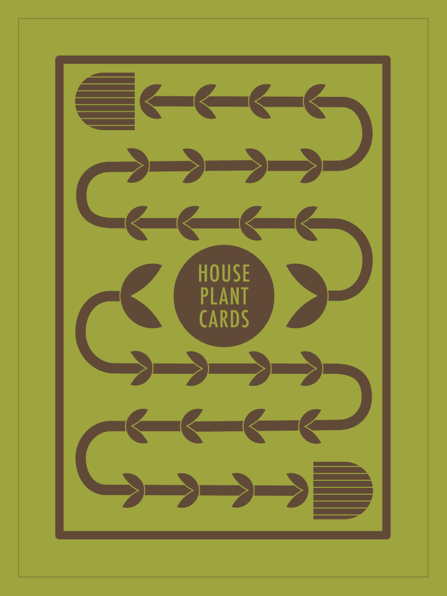
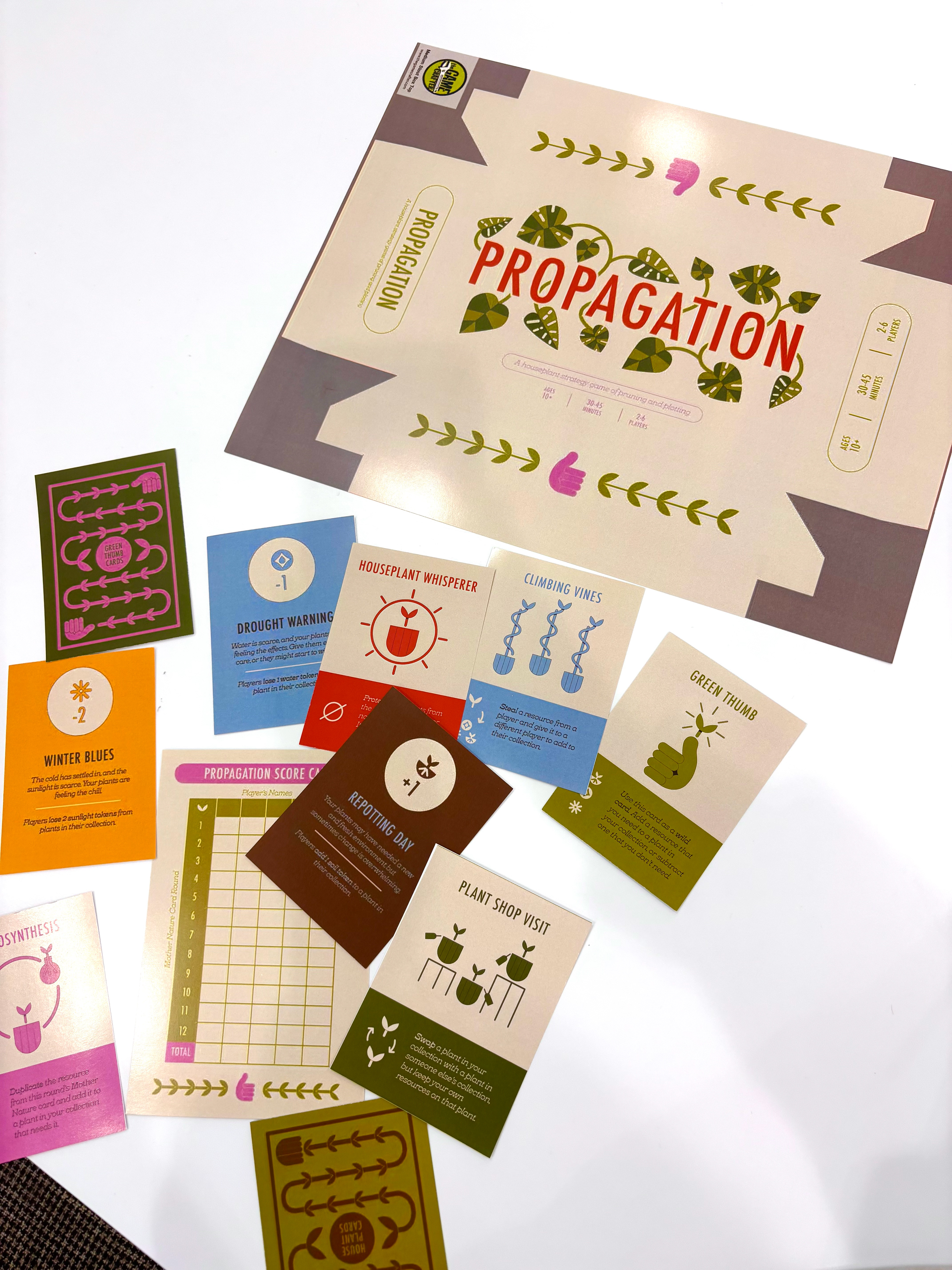
Designing the cards was the biggest part of the process. I started with the houseplant cards, which are the centerpiece of the game. I wanted each illustration to be funky, organic, and colorful, but still clear in showing what resources the plant needed. Through a few iterations, I refined the style and layout—adding color-coded icons on a blank background to make them easy to scan during gameplay. These cards helped shape the look for the rest of the game.
For the Mother Nature cards, I kept things super simple since their purpose is just to tell players what resource to gain or lose. I skipped illustrations and used a single-color design to match the associated resource. The Green Thumb cards took more tweaking—they started out too bold and distracting. I eventually switched to monochromatic illustrations that matched the houseplant style and included a small plant on each to tie them back to the main mechanic. In total, I designed 42 unique cards, each tailored to support gameplay in a clear and intentional way.

Green Thumb Cards

House Plant Cards
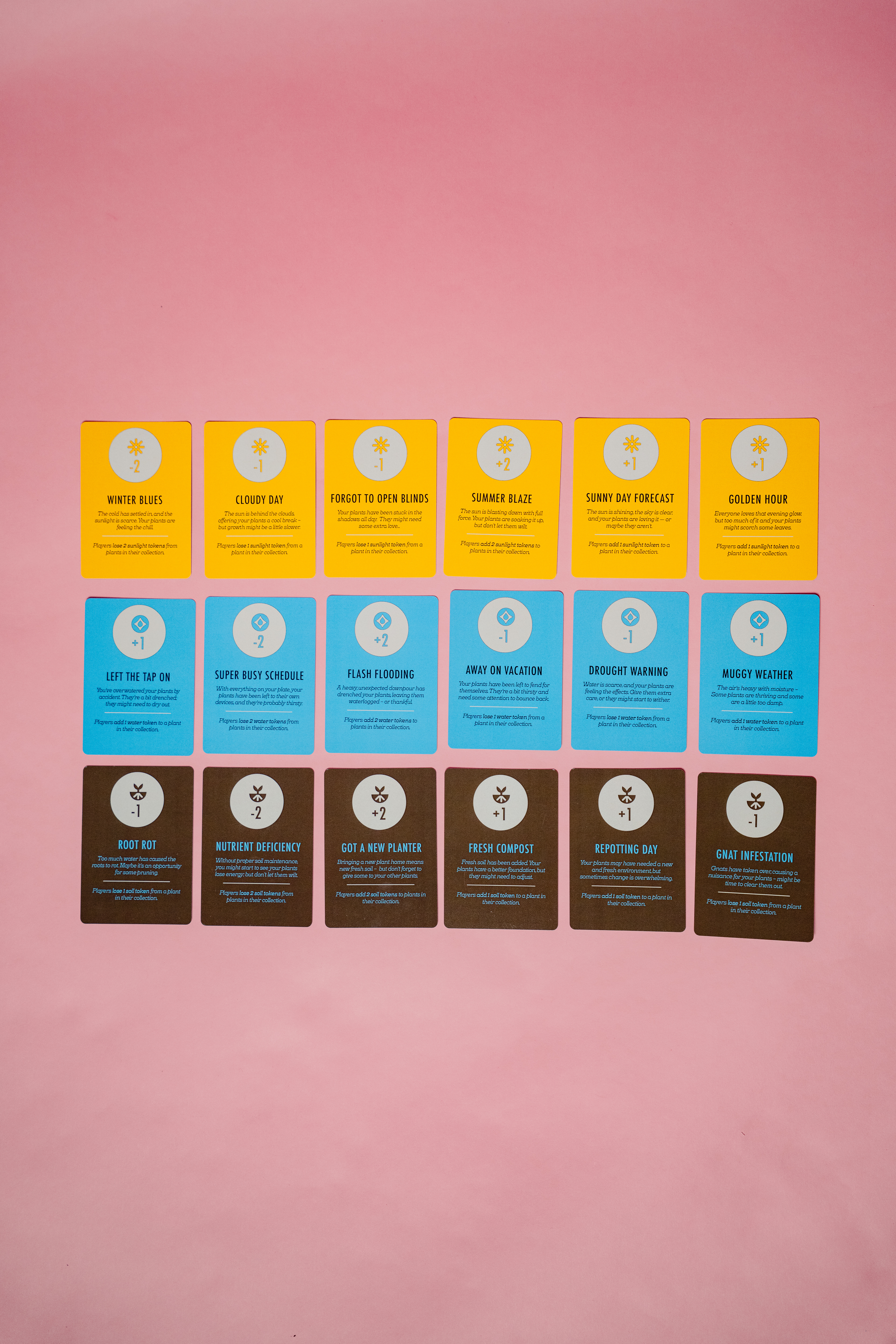
Mother Nature Cards
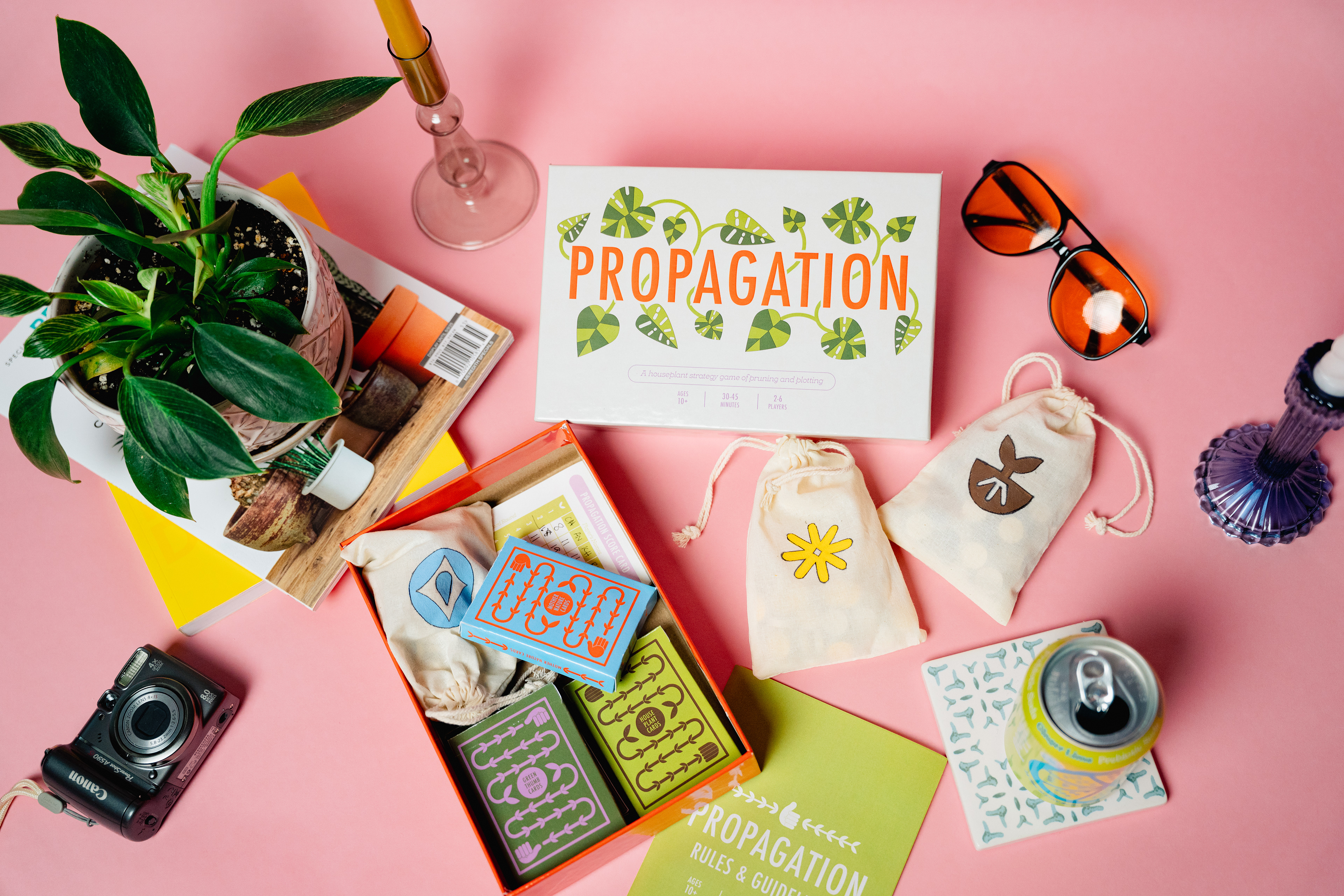
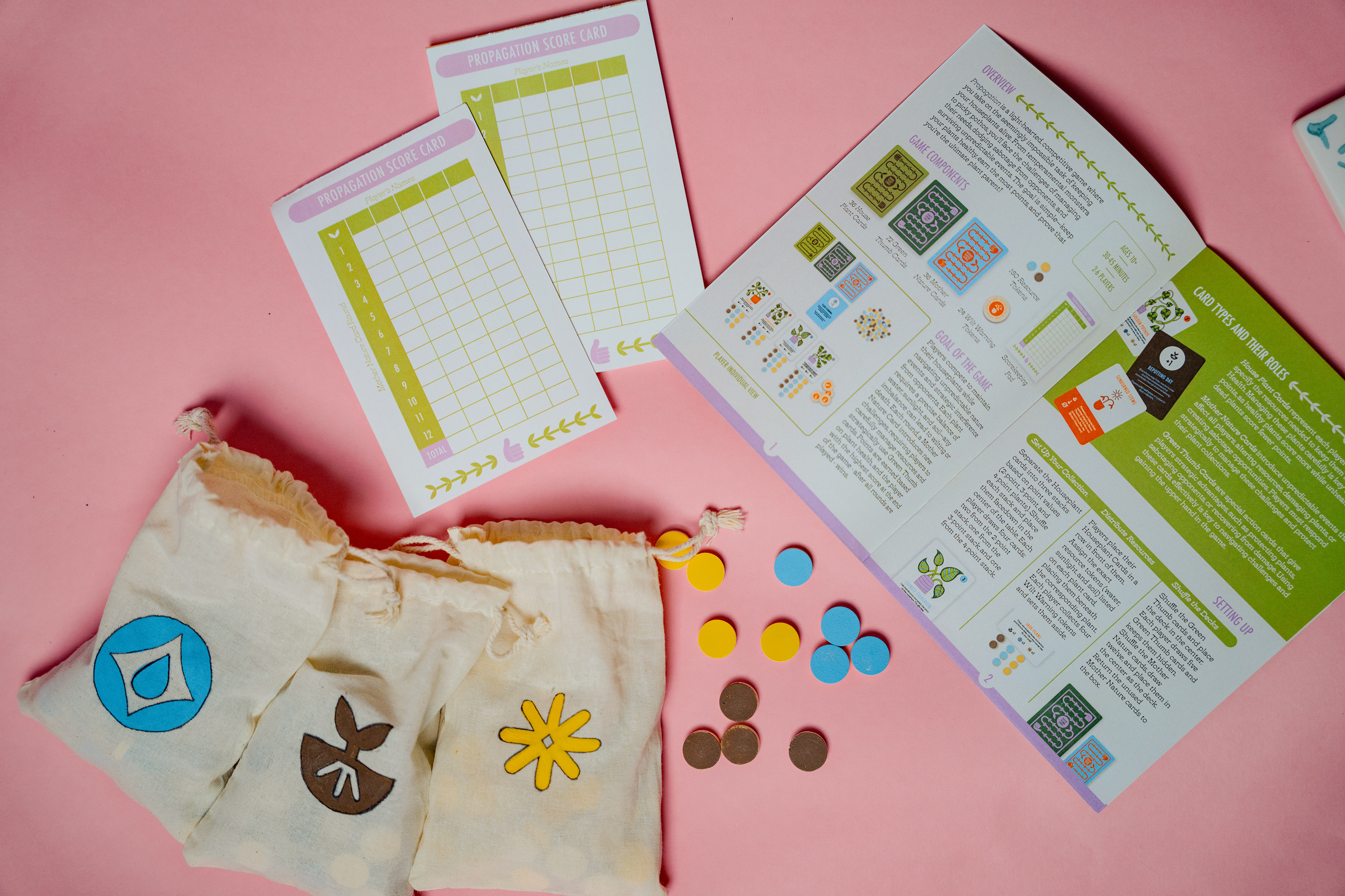
Beyond the cards, I also designed the box, tokens, rulebook, and score pad. I focused on consistency, using repeating shapes and patterns, like vines and pots, and made sure everything visually pointed back to the cards as the main feature. I studied other game boxes for inspiration and included all the expected details—like player count, age range, and playtime—while keeping the visual system cohesive throughout.

Supporting elements for Propagation

Propagation box design
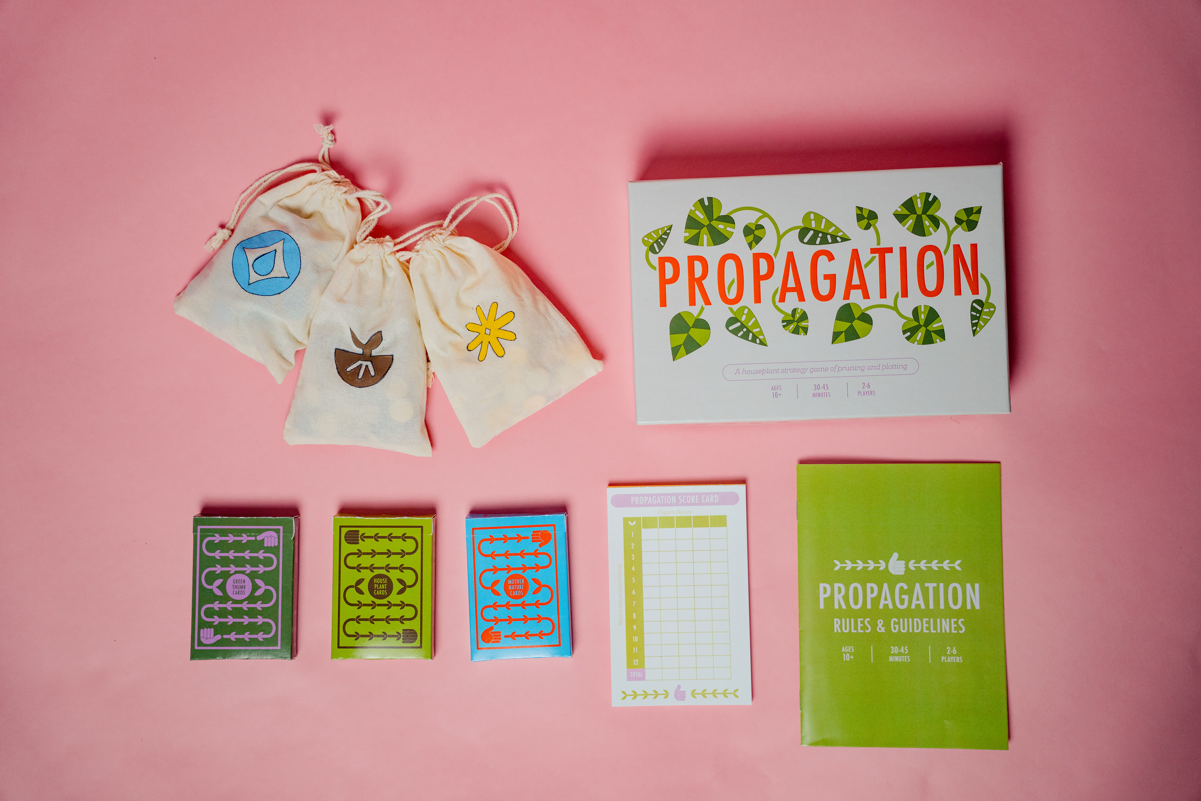
Supporting elements for Propagation
The Process - Product Development
A big part of wrapping up this project was actually producing a fully playable, physical version of Propagation. This meant being really intentional about things like font sizes, color choices, and scaling to make sure everything was readable and visually clear once printed. I used a custom board game printing company for most of the components—like the cards, box, and score pad—and adapted my designs to fit their templates for a polished, professional look.
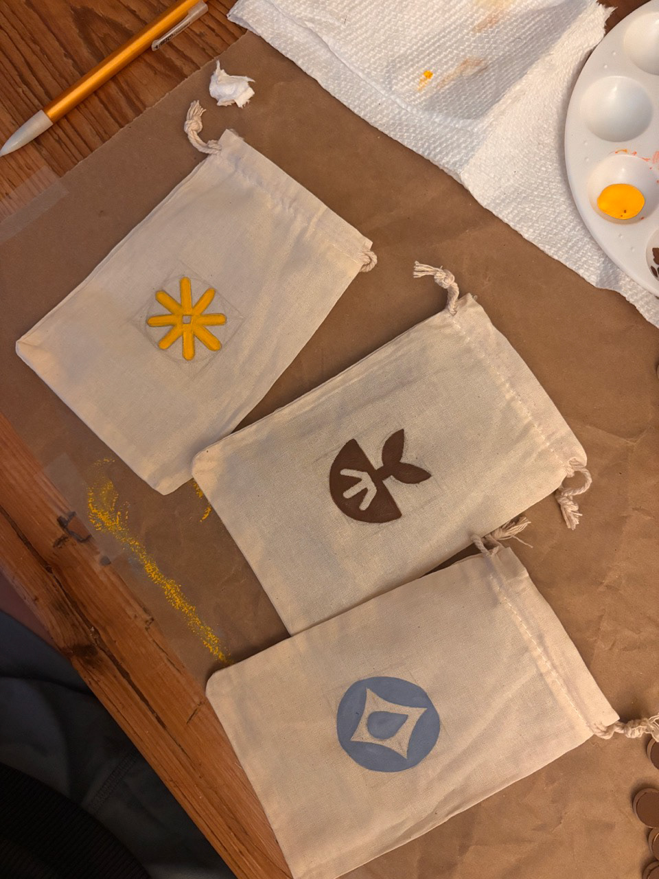
Some elements needed a bit more creative problem solving. I wanted the tokens to feel natural and modern, so I went with wood. For the wilt tokens, I designed them in Illustrator and had them printed through an Etsy shop. As for the resource tokens, I couldn’t find any pre-made ones that matched the game’s palette, so I hand-painted craft tokens myself and packaged them in custom-painted bags. Overall, this part of the process taught me a lot about production—how to work with different materials, printing techniques, and vendors to bring everything together into a final product that feels cohesive and complete.
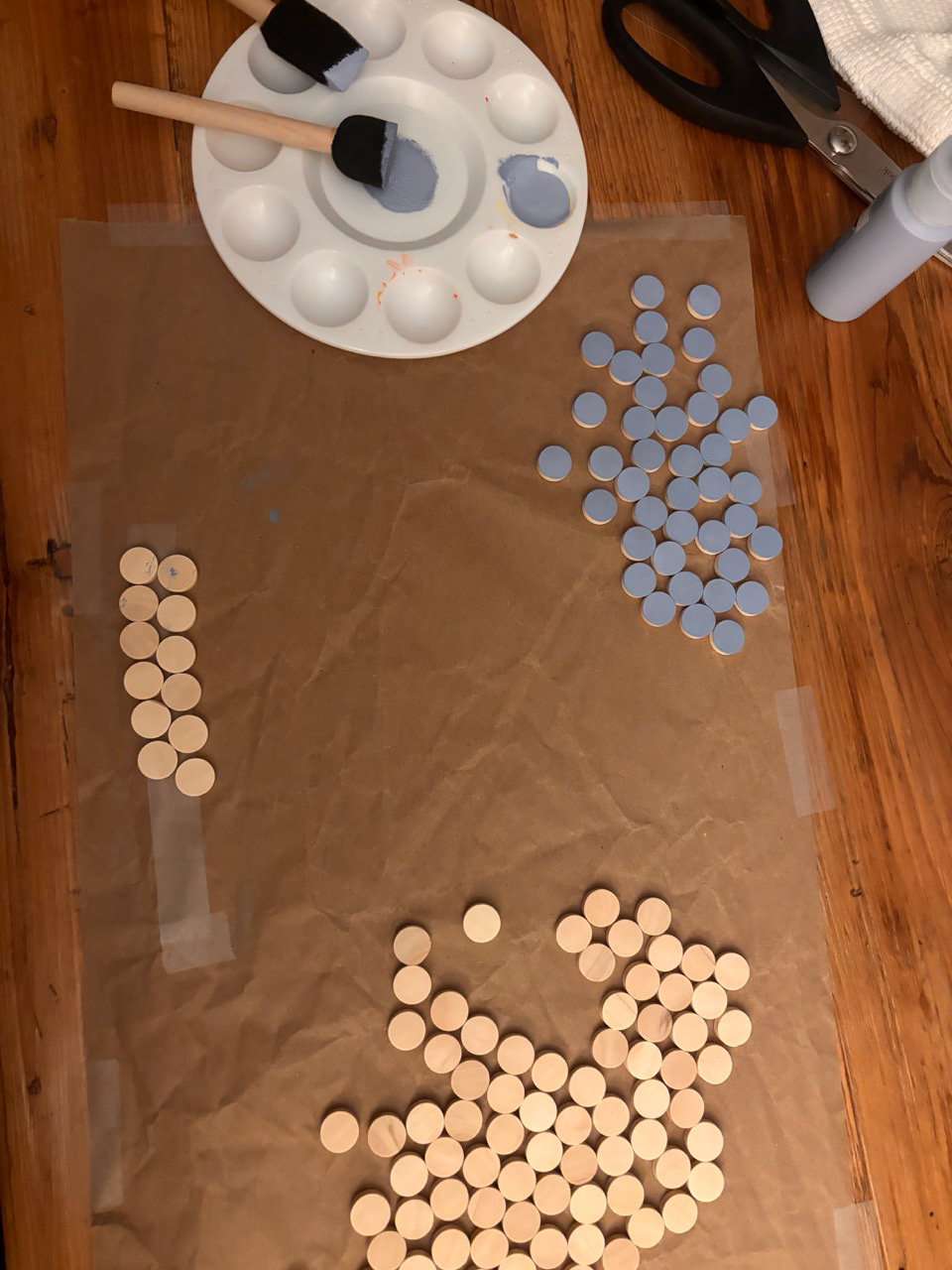
Painting individual resource tokens
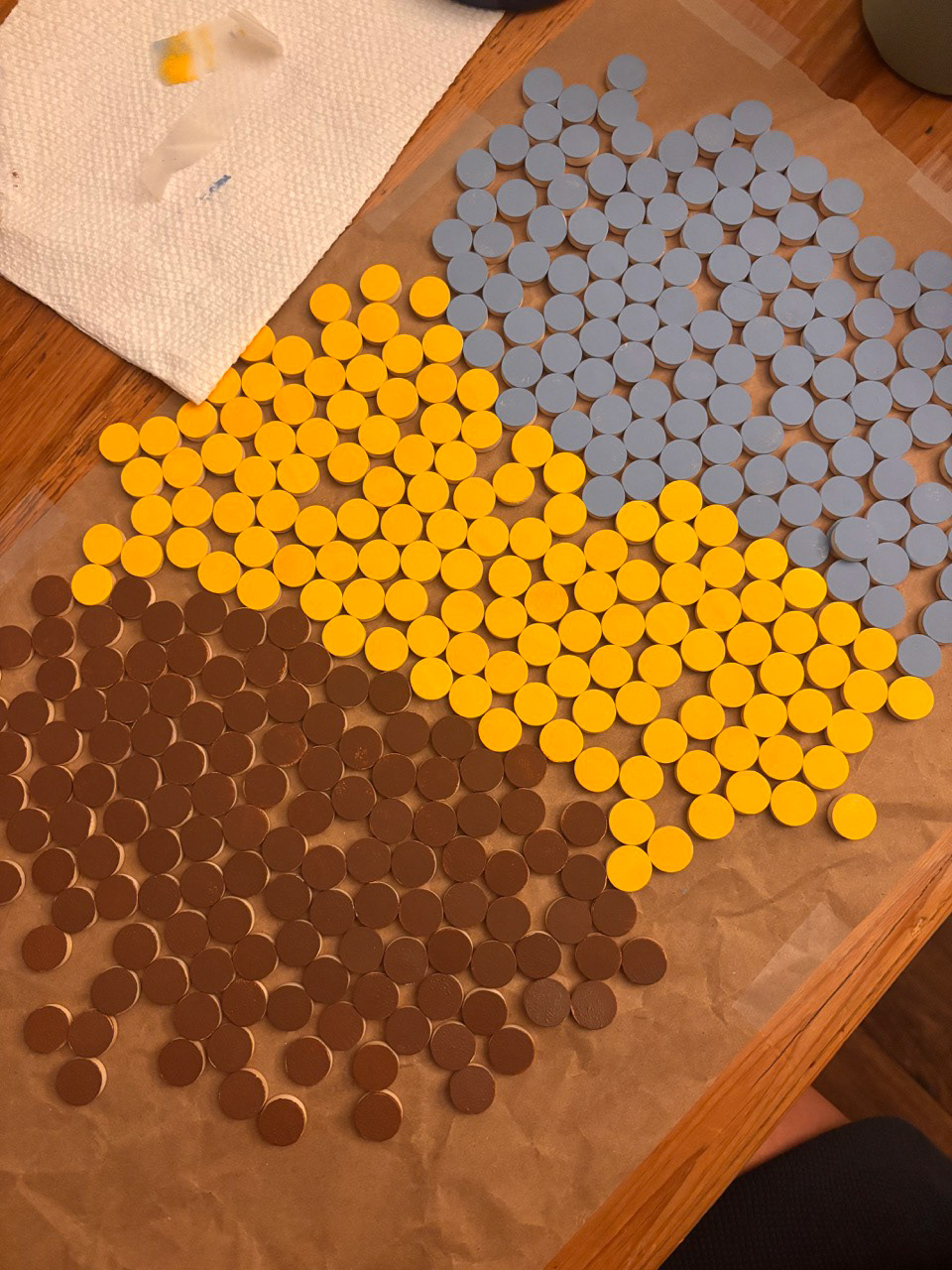
Painting individual resource tokens
Painting individual resource tokens
Reflections
This project was my first experience creating, designing, and printing a tabletop game, and it came with its fair share of challenges. As a Visualization Interactive Design student with limited game design experience, I found that my game design knowledge was a bit underdeveloped, though I discovered it’s a fascinating field that I’d like to explore more in the future. Due to the nature of capstone projects and time constraints, I would have loved to playtest more prototypes with more groups of people.
In conclusion, this project taught me valuable lessons in project management, game design, graphic design, user experience, and product development. I learned how to create a product from start to finish, gaining experience in areas that will benefit my career. A major focus for me was understanding user experience, and through playtesting and surveys, I feel I now have a deeper understanding of how users think and make decisions. This experience has shifted my perspective as a designer, showing me the importance of designing with the end product in mind and prioritizing functionality.
I want to give special thanks to Professor Anatol Bologan and mentors Mason Smith and Russell Gray for encouraging me in this project, guiding and influencing my work, and to my friends and family for spending so much time playtesting, photographing, and supporting Propagation.